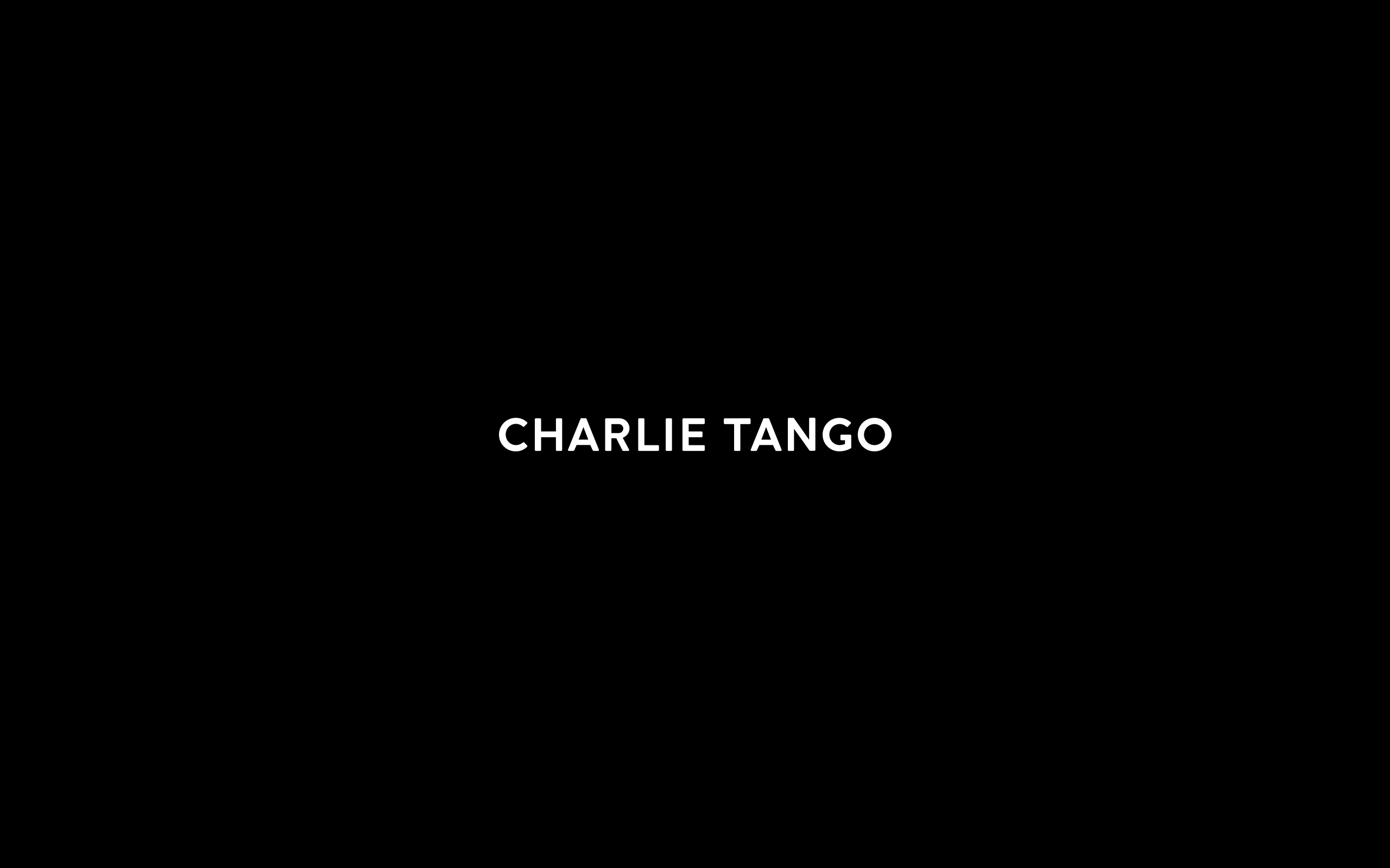
Charlie Tango
Let's Dance
Visual Identity
Charlie Tango is a result of a merger of three leading agencies into one Nordic digital powerhouse, backed by one of the largest IT solutions and services groups in the Nordics.
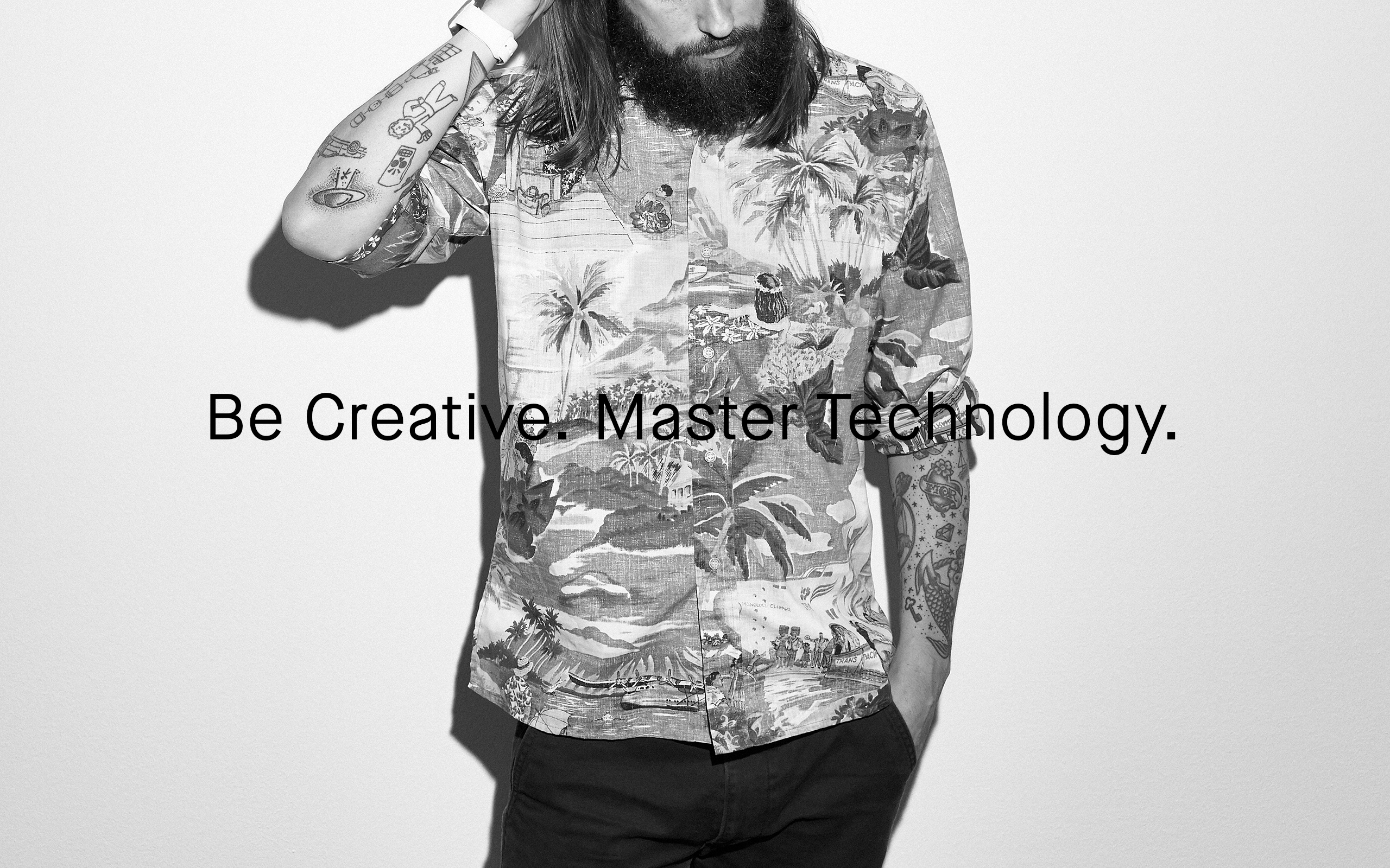
Charlie Tango want to be Creative and master Technology.
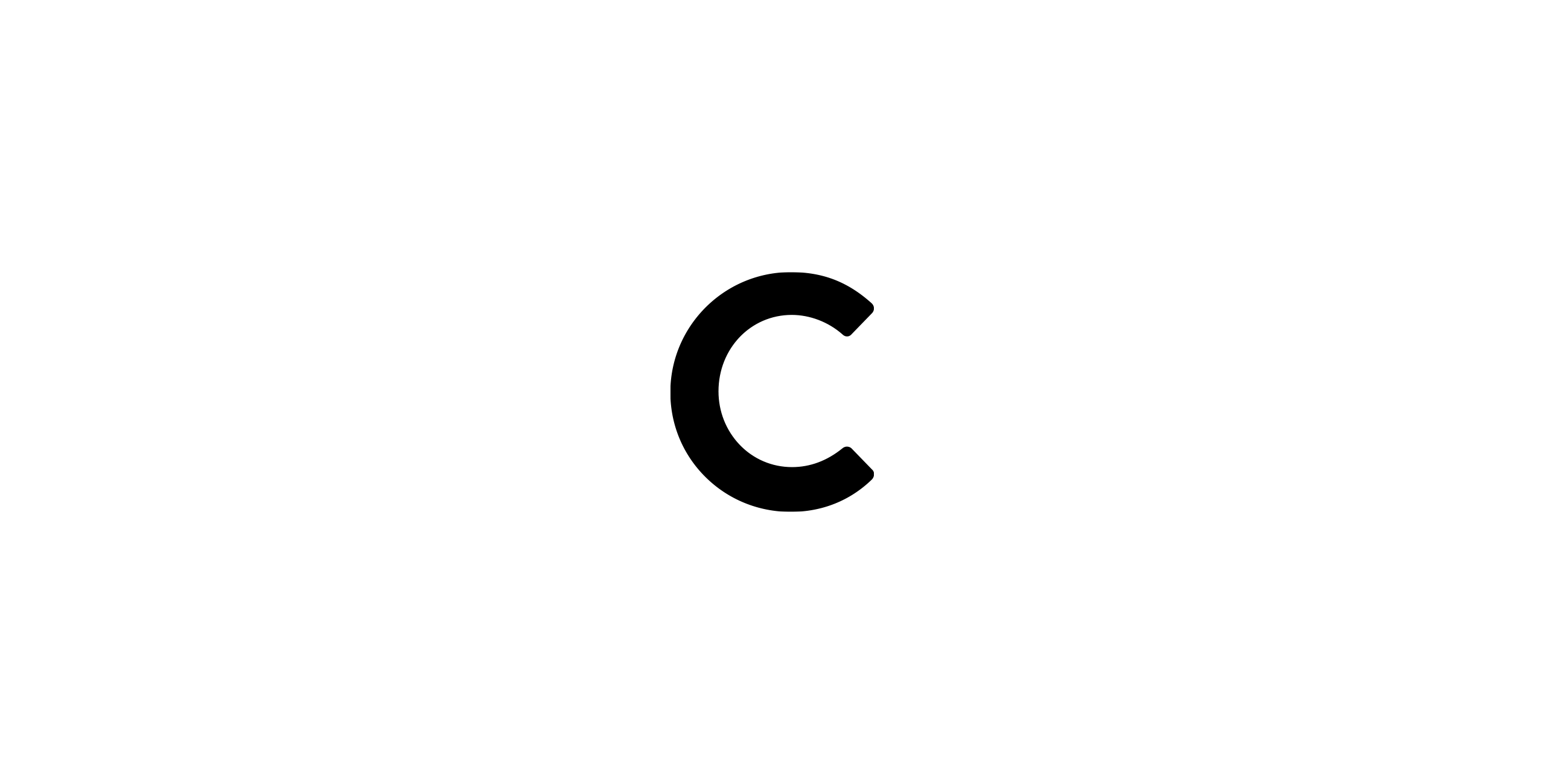
That is how the name Charlie Tango came to be. It originates from the letters C and T in NATO's phonetic alphabet. The letter C stands for Creativity and the letter T stands for Technology.
Visual expression:
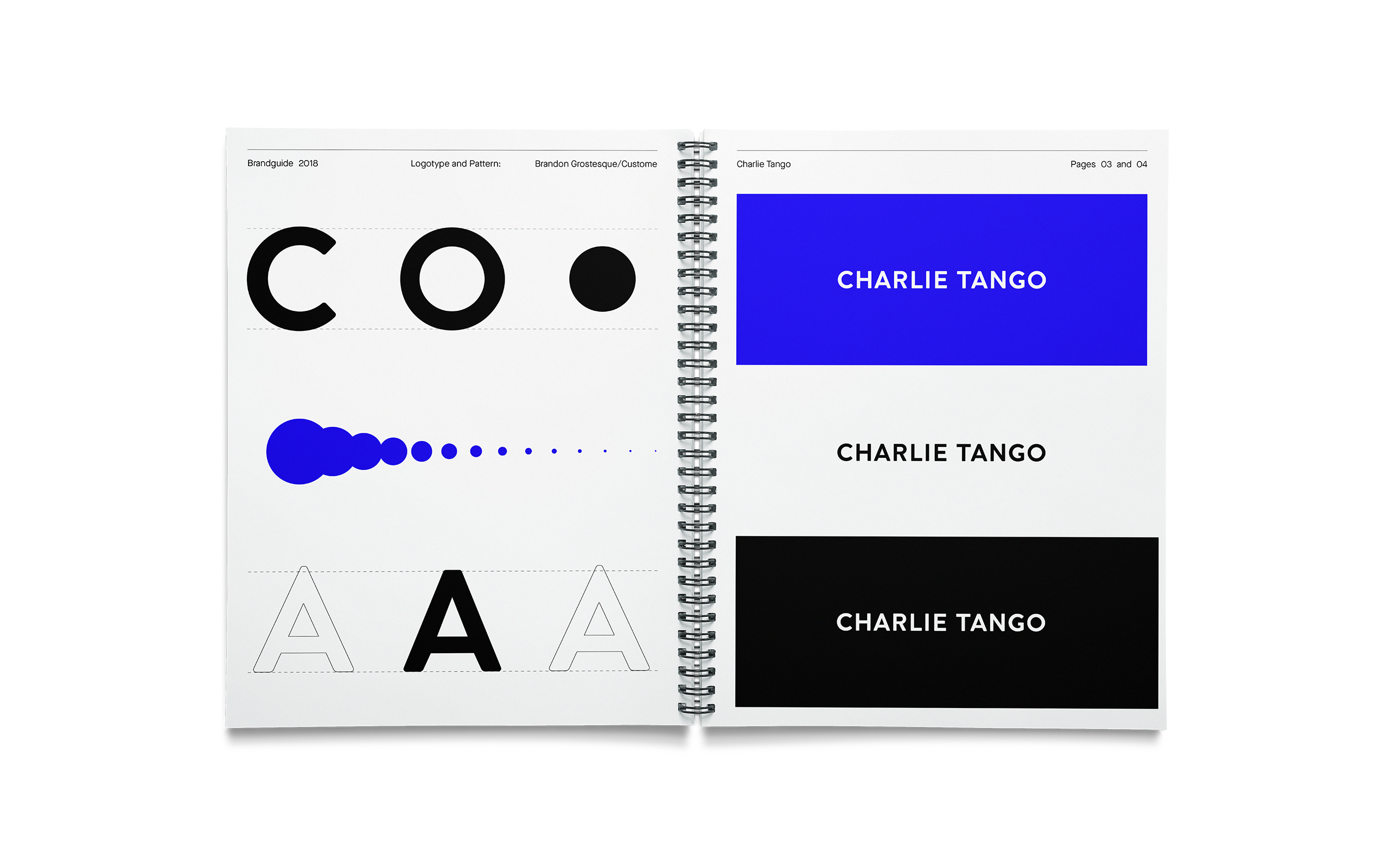
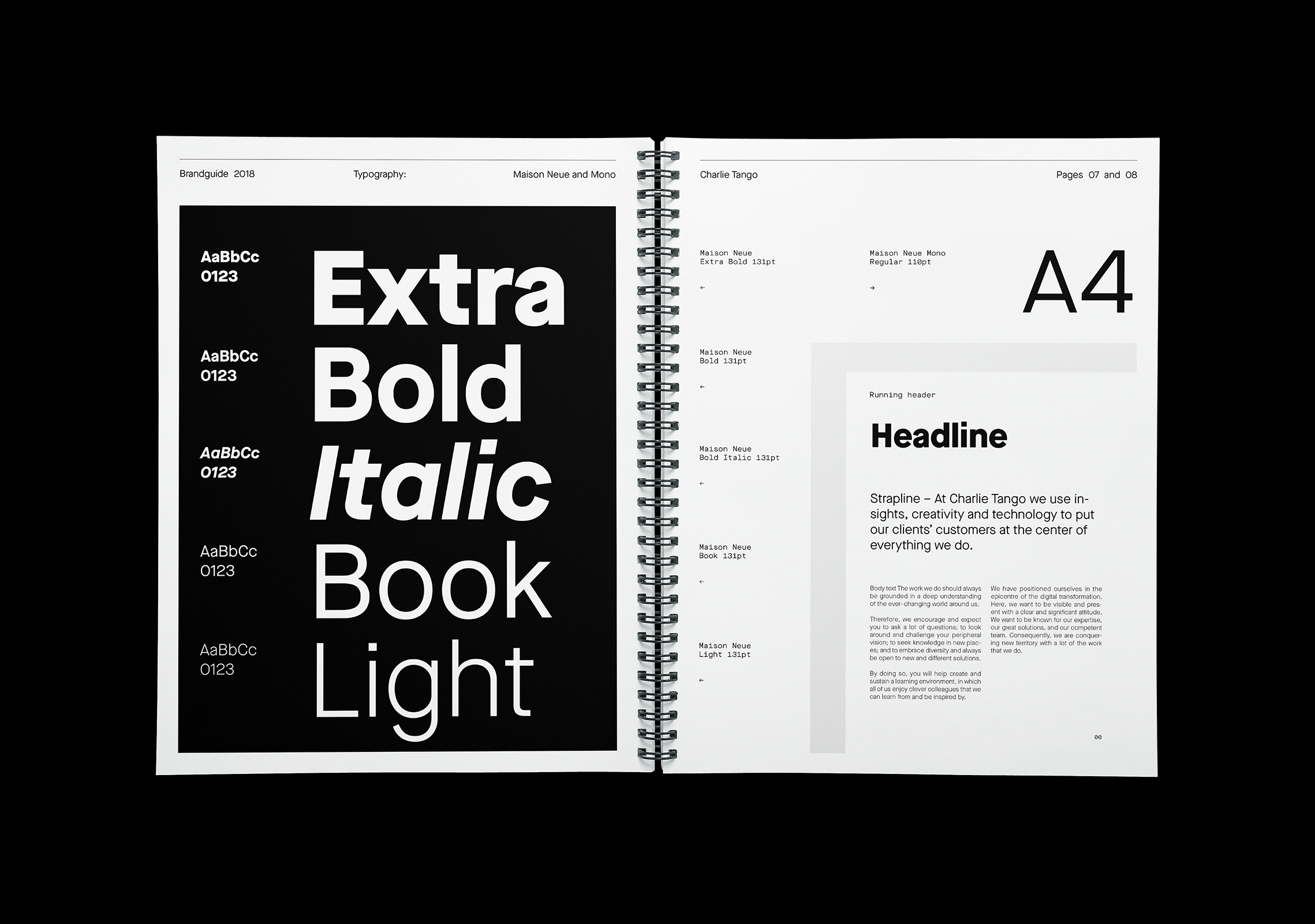
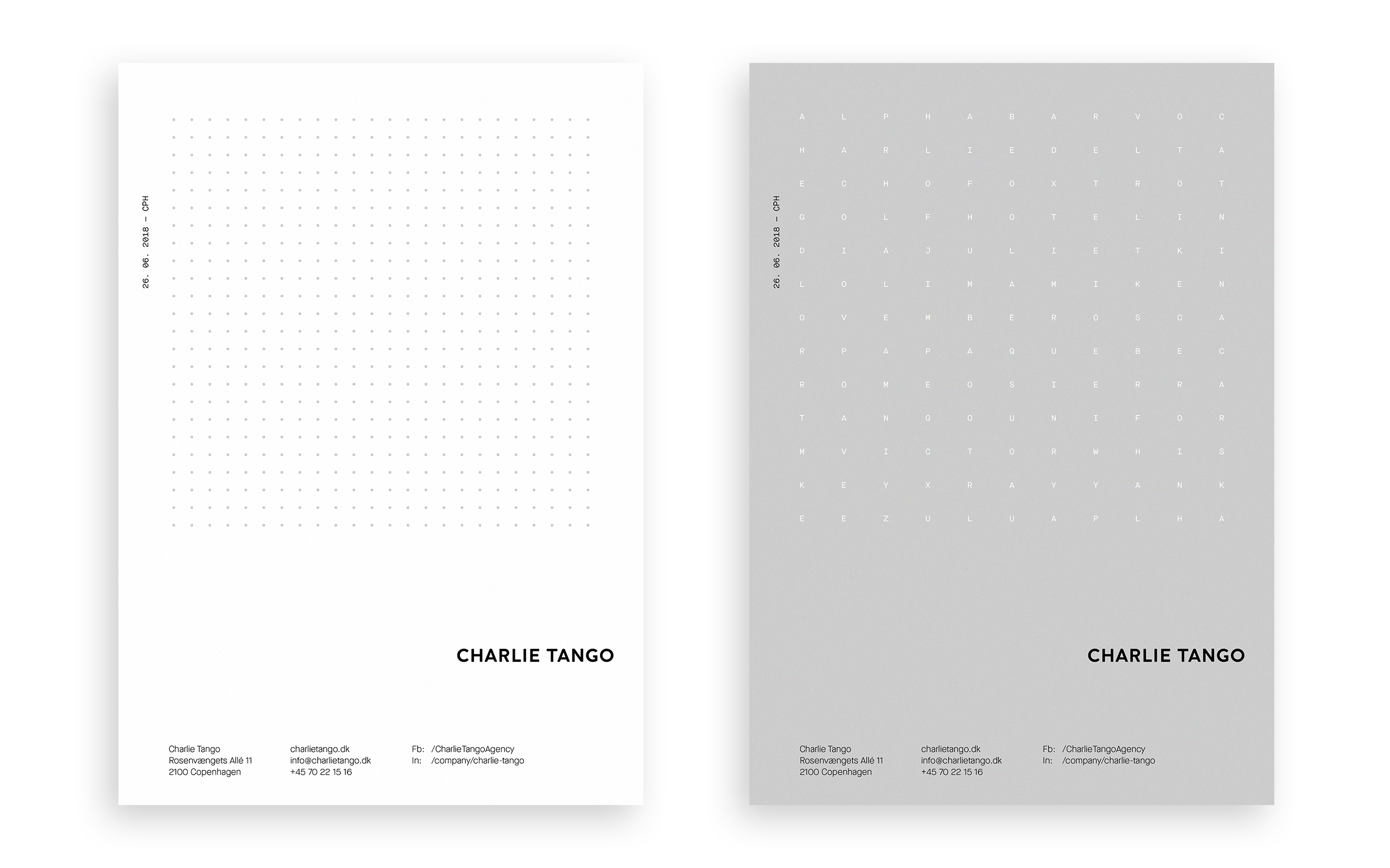
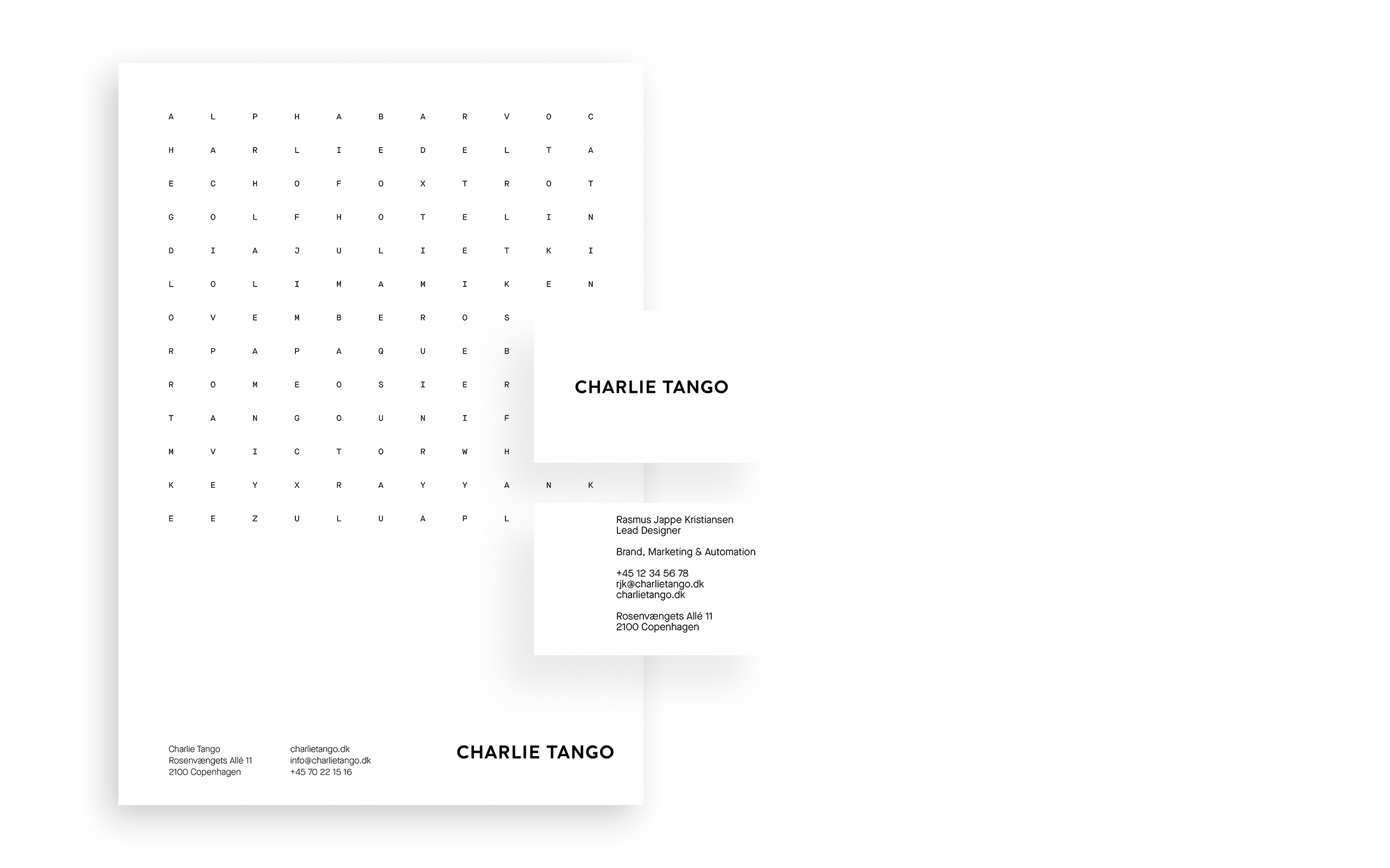
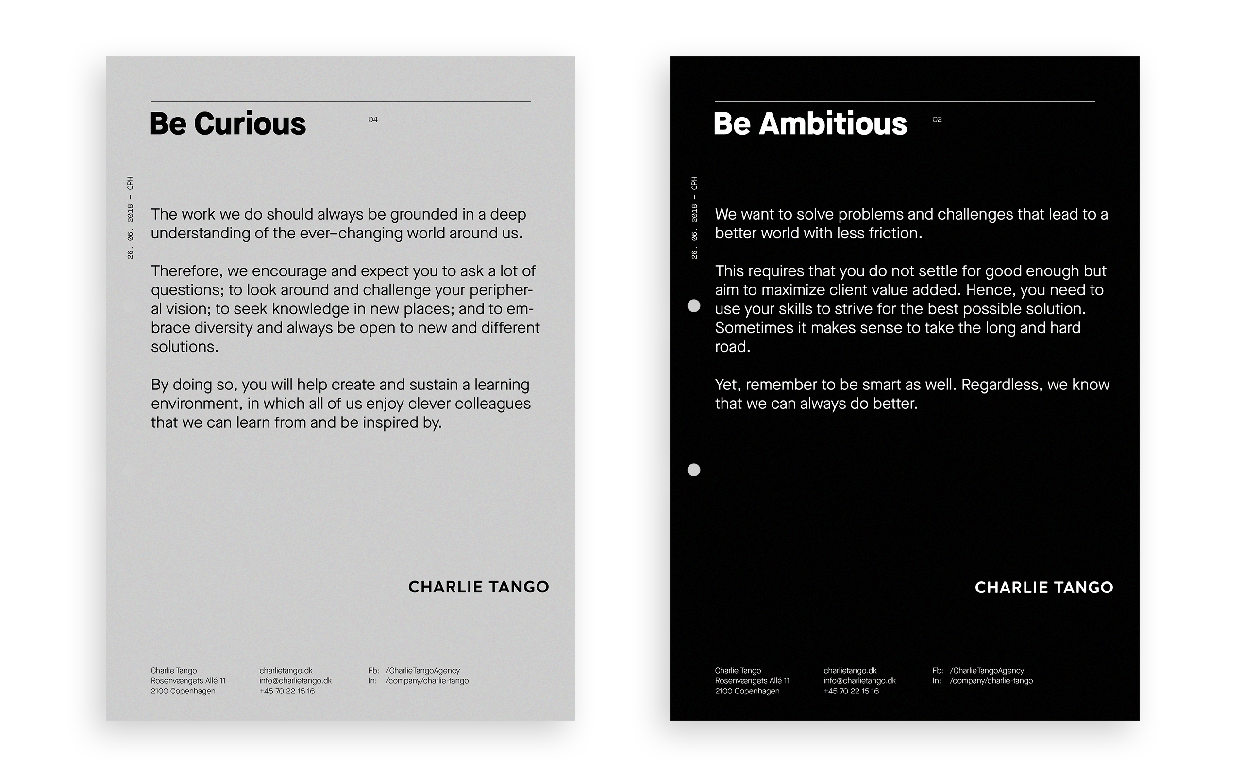
A simple and clean look with a robust and modern typeface, a corporate color scheme for the main stationary products, such as business cards, flyers, brochures and general paper line. It is timeless and robust logotype in all caps. The name CHARLIE TANGO is created from the typeface Brandon Grotesque and then modified to achieve the desired expression.
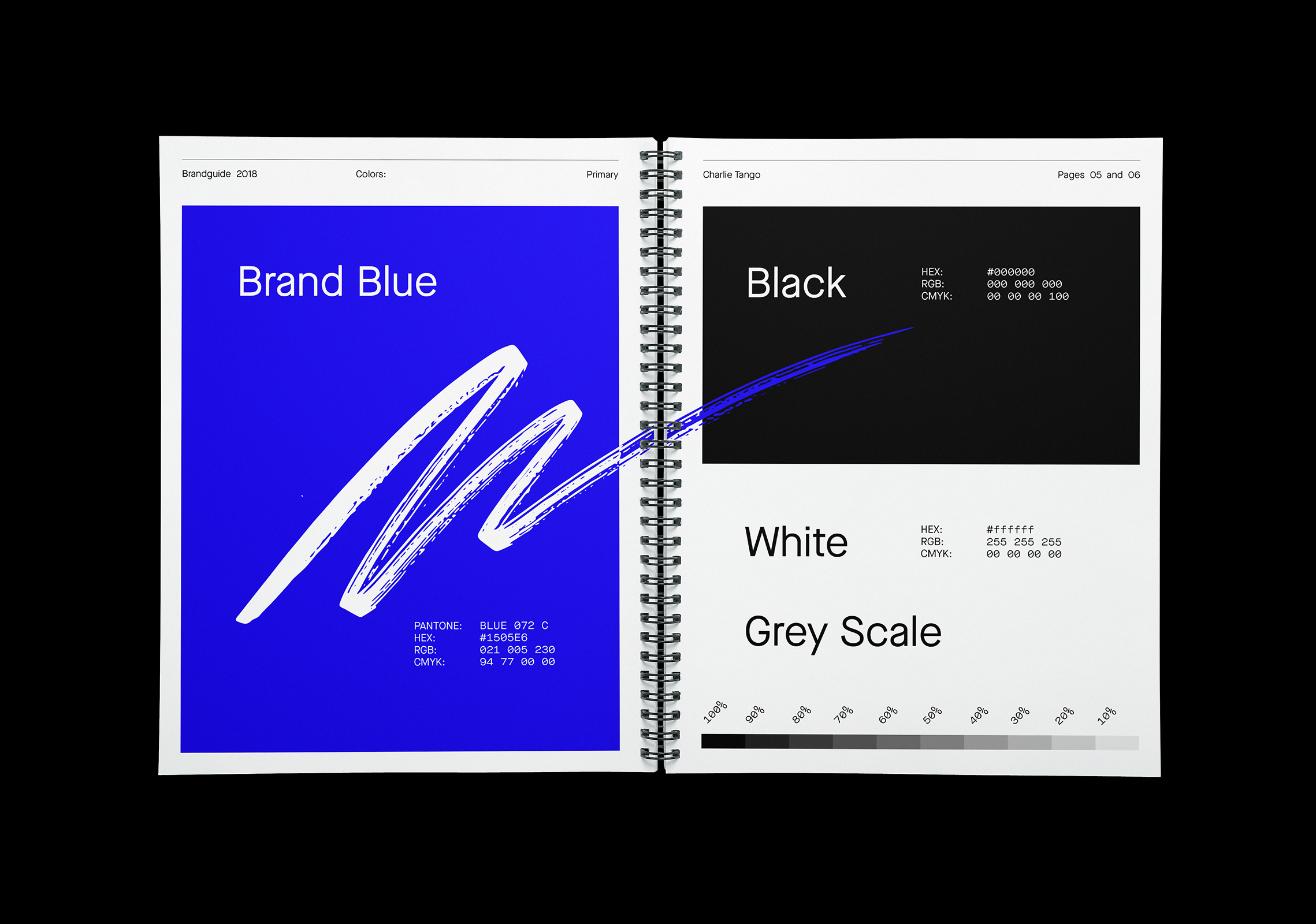
To give it all a bit of edge, we also use a large selection of secondary colors, handwriting, patterns, and brushstrokes. These can be seen across all of our social media profiles.
18
By: Charlie Tango

Credits
•
Team
Lead Designer:
Rasmus Jappe Kristiansen
Creative Director:
Rasmus Laumann
Creative Director:
Caleb Wilson
Employee pictures:
Christian Bang
My Contribution®
• Logo Design
• Art Direction
• Graphic Design
• Handwriting
Rasmus Jappe Kristiansen
Brand & Digital Designer.
Copenhagen, Denmark.
Let's Connect
Contact Info
©2015-2020 All rights reserved.